1. Define the objective, the target and the concept
This may seem obvious and it is often the case when you start to digitize a training project, but it is always good to remember it. What is the objective of your project? From a pedagogical standpoint, but also for you. Do you need to transform your training catalog? Do you need to digitize face-to-face training? Does the project aim to explore new training approaches in your Group? This will allow you to have in mind the end point and therefore influence the way you design your module.
For example, if you have to digitize your entire catalog, you will think about trying to “template” your design as much as possible to capitalize on this project and speed up the production of the following ones. Whereas if the goal is to impress, you will approach your project differently.
Regarding the target and the concept, nothing more to add than what the method suggests. Having your target in mind will allow you to better address it and defining the concept will allow you to wire yourself in the right storytelling.
2. Identify key messages
Identifying key messages is certainly one of the most difficult and crucial stages of instructional design. What are you going to broadcast in your project? Too much information and you risk losing your learner, not enough and he will wonder what was the point. It is during this sorting stage that you will begin to organize your project unconsciously. The first structural elements will begin to emerge and will culminate in the next step.
3. Build the architecture
As VTS Editor allows you to create narrative training including storytelling, here the idea is to structure your story. Unroll the main stages of the “movie” in your head and then put the key stages on paper. To help you organize a Digital Learning module, know that the Intro > Scenario > Debriefing format works really well. You should then support the part in the situation in the case of more immersive training.

If you want to make Rapid LEarning modules, replace the “Scenario” part with top-down content presented by one or more avatars and end the sequence with an evaluation.
Practical advice: be aware of what you can do and the budget / constraints you have.
At Serious Factory, we work on these steps on a text document by embellishing them with visuals (scenes/settings, illustrations of interactions, characters, etc.) This allows us to have a framework and a communication medium on which to iterate before validating and start the design.
4. Distribute key messages
In practice, this step is the mixture of the two previous ones. That is to say, once identified (step 2), the key messages tend to spread naturally as you imagine your unfolding. So don’t waste too much time with this step.
The main thing at this stage is that you have a clear vision of what to do in production. Congratulations, you have just finished designing your project, now all you have to do is!
5. Write the perfect script
At this point, you have two options depending on your context:
- Either you enrich your design document;
- Either you start producing.
If you work with a client, you need to lock down each step. If you are more comfortable writing the content in a doc before you or another person produces it in the tool, then I advise you to continue working on the design document. This will allow you to build a real exhaustive acceptance test.
If you already have in mind what you want to do, if the size of your project allows it or if you and the validators are comfortable with acceptance testing in VTS Editor, then you can start writing your ideal scenario.
6. Create alternatives
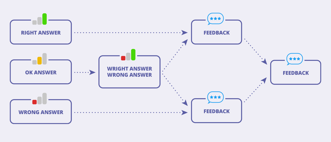
Regarding the alternatives: not all of them have the same impact on your scenario and on the design. If an avatar asks you to choose a drink from 5 options, the number of branches is certainly large, but we will very quickly transfer to the main branch. We therefore have an alternative rich in choice but limited in impact. Conversely, when Morpheus offers you to choose between the red pill or the blue pill, the choice is limited but the impact is major! All that to say, that the first option is a great way to create interactivity and immersion while limiting the work of writing and developing tree structures.
Practical advice: assess the relevance of creating a branch as well as its storyline depth for the learner. It is perhaps not useful to dwell on the impact of having chosen a hot chocolate rather than a coffee at the start of the simulation.
Here is a diagram that works well on the educational level:

7. Evaluate with scores and debrief
A point that is often tricky to deal with because you risk being torn in the level of finesse you want to put in place. The first piece of advice I can give you is to be well informed about how the results will be used. If the objective is to do Rapid Learning deployed for SCORM, it is not worth integrating 5 finely scored skills. Conversely, if you are developing a behavioral simulator, scoring on several skills becomes relevant.
Once you have determined the desired level of analysis, all you have to do is integrate the evaluation criteria. If this step was placed after the writing and design of the scenario, it is because it will be much easier for you to set up the score on an existing scenario rather than over the water. In particular to set up a scale that will be relevant to you. Identify the Interaction Blocks that contribute to your scoring and divide your scale by the number of blocks.
Last point concerning this stage, the debriefings. Do not hesitate to use feedback to re-orient the learner in the tree structure you are developing. Rather than writing overly long scenario branches for alternatives, use feedback via the Message Block and send your learner to the main branch.
8. Give your Experience the Juiciness it deserves
Penultimate step! The most delicate because it can be long. Indeed, the goal is to improve the level of finishes of your project to make it as juicy and as attractive as possible. We will deal with this step in 2 points, the sound and the graphics.
Let’s start with the sound, the first thing to do is to vocalize your project, at least in synthetic voice and at best with real actors. Then, add background music throughout your scenario. With these 2 ingredients, you will already have something fun and immersive. If you have the time and the skills, the next step is to add sound effects. VTS already offers a lot of sound feedback in case of right or wrong answer or if a badge is unlocked. You can go further if you use clickable areas to recreate interactions, such as clicking on buttons or offering new mini-games.
The second point is the graphics. Pay maximum attention to the media you integrate into VTS. Make sure you have a good compromise, weight / quality. Prioritize graphic consistency. If you want to immerse your learner in a medieval scenario, then a futuristic interface is to be avoided.
Practical advice: be lucid about your abilities. If you can’t do it, that’s okay, don’t. Look on image banks for some easily integrated elements (decorations for example) and leave it at that. Contextualize with descriptive texts to avoid having to illustrate. In juiciness the best is the enemy of the good.
9. Reread and deploy
You have reached the end, congratulations! You have done the hardest part. All you have to do is get your project proofread. I advise you to have it proofread by someone else in order to have a fresh look. The idea in this step is to ensure that there are no more typos and careless errors. Once this (these) proofreading(s) has been carried out, you can deploy on your usual platform, whether it is your LMS or on VTS Perform.
As specified in the beginning, this method should serve as a guide and help you move forward in the realization of your project. It is not there to be followed literally. It gives you a course, it’s up to you to live your adventure!
To go further, we invite you to download our 9-step Methodology directly.
Start now to create your training content with the trial version of VTS Editor :


